TThe most compelling interiors are rarely the ones that announce themselves. Their success lies instead in the quiet resolution of complexities that remain invisible to those who inhabit them. A jodi apartment, formed by merging two independent residences into one, carries a hidden architecture of compromises: duplicated services, misplaced columns, fragmented circulation, and structural interruptions. The designer’s challenge is not simply to combine spaces, but to erase all evidence that they were ever separate.
Set within Kalpataru Radiance in Mumbai, this 1,740 sq. ft. residence by Design Vault, led by Ar. Supreet Nanda and ID Shilpy Gupta, was conceived for a family of four seeking a home that felt expansive, cohesive, and deeply personal. The inherited shell presented a series of obstacles, from awkwardly positioned kitchens and structural columns to a plan lacking any clear spatial hierarchy. Rather than treating these conditions as limitations, the designers used them as opportunities to choreograph a more considered experience of the home.
What emerges is a sequence of spaces that unfolds with remarkable ease. Architectural interventions conceal complexity while creating moments of arrival, pause, and connection throughout the residence. Grandeur and restraint are carefully balanced, allowing each room to contribute to a larger narrative of warmth, functionality, and quiet sophistication. The result is a home that feels as though it was always intended to exist in this form, its challenges absorbed so completely into the design that they become impossible to detect.

The entrance establishes the home’s design language with quiet assurance. A walnut-toned door sits within a composition of fabric-inset panels, introducing a material palette that balances warmth with refinement. Through a slender grilled opening, a glimpse of the temple beyond creates a subtle visual axis, offering a moment of anticipation before the interior fully unfolds. Rather than relying on overt gestures, the threshold uses proportion, materiality, and carefully controlled views to shape the experience of arrival.
The detailing is restrained yet meticulous. Every element feels considered, from the interplay of textures to the integration of the family’s identity within the entry composition.

Inside, the foyer is designed to perform far more than a ceremonial role. Concealed behind finely detailed panelled cabinetry is the practical infrastructure of everyday life: shoe storage, household utilities, and the various necessities that allow the home to function seamlessly. Rather than treating these requirements as compromises, the design integrates them into the architecture itself. A softly scalloped portal frames the cabinetry, while a muted aqua ceiling panel suspended beneath a crystal pendant introduces an unexpected note of colour to a space that might otherwise have receded into neutrality.
The floor becomes the foyer’s most understated gesture. A field of grey marble is punctuated by precisely inset bands of darker stone, creating a measured geometric composition that subtly directs movement toward the living areas beyond. The pattern nods to the formality of traditional chequered foyers without resorting to direct quotation, translating a familiar motif into a more contemporary language. It is a detail that reveals itself gradually, rewarding closer attention rather than demanding it.

To one side of the foyer, a sculptural console composition introduces a more personal register to the home. A series of arched stucco niches arranged in a rhythmic grid display framed caricatures of the family, transforming the wall into a curated portrait of its inhabitants. In a residence defined by careful restraint, this gesture brings a sense of individuality and warmth, grounding the architecture in the lives it was designed to accommodate.
Below, a walnut console with fluted detailing and finely inlaid accents adds depth and craftsmanship to the composition. Richly detailed yet never ostentatious, it balances decorative expression with material discipline.

Step further inside, and the home’s central spatial proposition becomes clear. The living and dining areas are conceived not as separate rooms, but as a single continuous landscape, defined by carefully orchestrated sightlines rather than physical partitions. The absence of walls allows the eye to travel effortlessly across the length of the home, creating a sense of generosity that belies the apartment’s urban footprint.
A brass framed display cabinet anchors one end of the composition, while a sculptural chandelier above the dining area establishes a counterpoint at the other. The foyer’s arched portal completes the sequence, creating a visual rhythm that ties the spaces together. Each element acts as a marker within the larger composition, guiding movement and framing views without interrupting the openness of the plan.

The living room is conceived as a vessel for light. Floor to ceiling sheers soften Mumbai’s intense daylight, diffusing it across the room and lending every surface a gentle luminosity. A restrained palette of oatmeal, dove grey, and a carefully placed accent of seafoam velvet reinforces the sense of visual lightness, allowing the space to feel calm, open, and effortlessly elegant. At its centre, a low marble coffee table adopts a deliberately understated presence, serving the composition rather than competing within it.
What distinguishes the room is its refusal to equate scale with excess. Jodi apartments often invite an impulse toward abundance, filling newly acquired square footage with increasingly assertive furnishings and decorative gestures. Here, the opposite approach prevails. The furniture is thoughtfully edited, and the generous volume is allowed to remain perceptible, creating a sense of ease that is often difficult to achieve in contemporary urban homes.
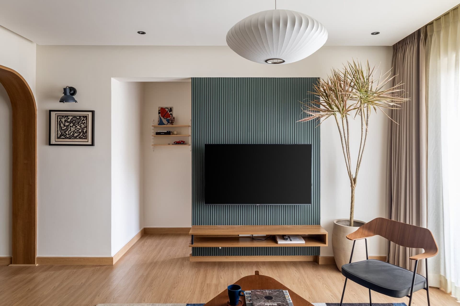
The television wall accommodates one of the home’s most refined architectural interventions. A fluted plaster feature descends seamlessly from ceiling to floor, its vertical rhythm lending the impression of fabric suspended in motion. More sculptural than decorative, the element introduces a sense of softness and fluidity to a composition that might otherwise have been defined by harder geometries.
Its presence is particularly effective in balancing the rectilinear forms of the television and the floating console beneath. Rather than competing for attention, the fluted surface acts as a mediating element, tempering the sharpness of the surrounding architecture and adding depth through light and shadow. The gesture is understated yet transformative, demonstrating how a single carefully considered detail can alter the character of an entire room.

From this vantage point, the spatial choreography of the home’s public areas becomes fully legible. A gently curved corridor wall guides movement toward the private quarters, while a softly draped curtain panel beside the television introduces a moment of visual pause. Beyond, a scalloped arch frames the transition into the adjoining room, reinforcing the sense that each threshold has been carefully considered rather than simply inserted into the plan. These recurring curves form one of the project’s most consistent architectural devices. They are not ornamental gestures applied after the fact, but elements that actively shape the experience of moving through the home.

The mandir is conceived as one of the home’s most carefully resolved compositions. Enclosed within a finely detailed brass toned metal and glass structure, it presents itself less as a separate room and more as a crafted object embedded within the larger interior. At its centre, a softly profiled stone arch forms a sacred backdrop, layered with Sanskrit calligraphy and the family’s deities, creating a setting that feels both intimate and ceremonial.
What makes the space particularly compelling is the way it negotiates tradition through a contemporary lens. Rather than relying on overt ornamentation or historical replication, the design uses proportion, materiality, and restraint to evoke a sense of reverence. The sleek architectural framing sits comfortably alongside deeply rooted spiritual symbolism, allowing the mandir to feel timeless rather than nostalgic.
In doing so, it addresses a question that many contemporary Indian homes grapple with: how to honour tradition without reducing it to decoration.

The dining area is anchored by a long crystal chandelier that floats above a marble topped table, establishing a sense of occasion without overwhelming the space. Behind it, a peacock and blossom artwork rendered in soft blue tones introduces colour, texture, and narrative, serving as the emotional focal point of the room. A walnut buffet positioned alongside a slender metal and glass partition creates a subtle threshold between the dining space and the mandir, maintaining visual continuity while gently defining their respective functions.
Viewed from the living area, the dining zone assumes a more architectural presence, reading as a distinct room within the larger open plan. The artwork acts as a visual anchor, while the chandelier descends with a carefully judged proportion that reinforces the room’s sense of balance and order. Together, these elements lend the space a quiet authority, allowing it to hold its own within the broader composition without relying on enclosure.

Concealed behind a sliding door just off the foyer, the kitchen is approached with a sense of practical clarity that complements the more expressive spaces beyond. Its design is restrained and purposeful, prioritising functionality while remaining firmly connected to the home’s broader material language. A run of muted oyster toned cabinetry establishes a calm and understated backdrop, paired with a ribbed grey stone backsplash that introduces texture without visual noise.
The room’s most distinctive gesture arrives in the form of a deep green stone countertop, a colour largely absent from the rest of the home. Rather than reading as a deliberate accent, it feels like a natural extension of the material palette, bringing depth and richness to a space otherwise defined by tonal restraint. The stone anchors the composition, lending the kitchen a character of its own while preserving the overall sense of cohesion.
What emerges is a room that resists unnecessary embellishment. Every surface appears chosen for utility as much as aesthetics, resulting in a kitchen that feels grounded, efficient, and quietly elegant. It is a space designed for daily use, confident enough to let material quality and proportion carry the experience rather than relying on decorative effect.


The master bedroom retreats into a palette of muted earth tones, creating an atmosphere that feels calm, enveloping, and deliberately removed from the activity of the home’s public spaces. A panelled feature wall in soft beige forms the room’s primary architectural backdrop, while a tan leather upholstered headboard introduces warmth and tactile depth. The composition is resolved with quiet precision, allowing material nuance and proportion to take precedence over ornament.
At one end, the wall transitions into a series of arched niches that house a solitary ceramic object, transforming what might have been a decorative gesture into a moment of contemplation. The restraint is intentional; rather than filling the niches with display pieces, the design allows a single object to hold the space, reinforcing the room’s sense of calm and focus.
What distinguishes the bedroom is its consistency of language. The same softened curves that shape circulation and transitions elsewhere in the home reappear here in a more intimate register, lending the space a sense of continuity without repetition. They soften the geometry of the room, tempering its linear elements and ensuring that the bedroom feels connected to the larger architectural narrative while maintaining its own quiet identity.

A compact study nook carved into the master bedroom extends the room’s language of restraint into a space dedicated to work and reflection. A fabric clad wardrobe detailed with slender timber inserts forms a textured backdrop, while a simple wooden desk occupies the foreground with understated confidence. Above, a recessed shelf holds only a handful of carefully chosen objects, a pair of books and a sculptural figure, arranged with the precision of a considered still life.
The composition relies on editing rather than abundance. Every element appears intentional, with nothing present that does not contribute to the overall sense of calm. The muted material palette and clean lines allow the space to remain visually quiet, ensuring that the study corner feels integrated into the bedroom rather than functioning as a separate zone imposed upon it.


The second bedroom shifts the home’s material palette toward a gentler, more delicate register. A textured beige plaster wall rises above a wood panelled dado, creating a layered backdrop that feels warm without becoming overly decorative. Set against it, an upholstered headboard with refined vertical channelling introduces softness and rhythm, while an abstract artwork in muted coral tones lends the room a subtle note of colour.
What distinguishes the space is its measured approach to character. Rather than relying on overt motifs or predictable signifiers, the room builds its identity through tone, texture, and proportion. The palette remains restrained, the forms remain clean, and the decorative elements are carefully edited, allowing the atmosphere to emerge gradually rather than announcing itself at first glance.
The result is a bedroom that feels quietly feminine without ever becoming literal.

The son’s bedroom embraces a more pared back material expression, reflecting the studio’s interest in allowing finishes to speak for themselves. A textured stone grey plaster wall forms the room’s primary backdrop, animated by the gentle wash of ceiling mounted spotlights that cast soft pools of light across its surface. Below, a ribbed dark grey dado introduces depth and rhythm, creating a composition that feels grounded, tactile, and quietly architectural.
The palette is deliberately restrained, relying on tonal variation and material texture rather than colour or ornament to establish character. This approach lends the room a sense of maturity and permanence, allowing the interplay of light and shadow to become an active part of the design experience.
Detailed with leather loop accents, it softens the room’s otherwise rigorous material language and brings a welcome note of tactility to the composition. The gesture is small but effective, demonstrating how carefully considered details can enrich a space without disturbing its overall sense of restraint.

Viewed in its entirety, the room reveals a second layer of functionality beyond its restrained material palette. A wall of grey wardrobes provides generous storage, while open shelving units in deep walnut introduce warmth and visual depth at either end. Together, they create a composition that feels integrated rather than utilitarian, balancing practicality with a strong architectural presence.
What distinguishes this project within Mumbai’s increasingly crowded residential landscape is its ability to accommodate moments of richness without allowing them to dominate the experience of the home. Jodi apartments often carry an unspoken expectation to justify their expanded footprint through overt displays of luxury. Here, Design Vault takes a more disciplined approach, directing its attention toward the less visible aspects of design: the quality of transitions, the calibration of sightlines, and the seamless integration of everyday functions that make a home genuinely livable.
The result is an interior that feels remarkably cohesive. Rather than presenting a sequence of individually styled rooms, the residence unfolds as a continuous architectural narrative. Curved forms echo across spaces, arched motifs reappear in evolving interpretations from foyer to mandir to corridor, and a restrained material palette establishes a sense of continuity while allowing for carefully measured moments of variation. Every decision appears connected to a larger idea, creating a home that feels considered at every scale.
In a city where residential interiors are increasingly designed for the camera, this project offers a quieter proposition. Its success lies not in spectacle but in coherence, not in statement making but in the cumulative effect of thoughtful decisions. The home feels designed to support everyday life first and photography second, a distinction that ultimately gives it both its character and its longevity.