Japandi has become one of the most widely interpreted design languages of the past decade, often finding its way into Indian homes as little more than a palette of pale timber, muted neutrals, and pared-back minimalism. This 1,400 sq. ft. residence at Lodha Sterling offers a more nuanced interpretation, where the quiet restraint of Japanese design is balanced by the warmth, material richness, and everyday rituals of Indian living.
Designed by Maksideo Design Consultants, led by Ajinkya M. Patil and Karan M. Patil, the Kolshet residence was shaped by a client with two clear priorities: generous concealed storage and an interior free from rugs or decorative elements that collect dust. Rather than treating these requirements as limitations, the studio integrated them into the architecture itself, allowing storage to disappear within the built fabric of the home while keeping every space open, uncluttered, and easy to maintain.
The resulting interior is understated yet deeply tactile. Handmade Borobu tiles from Bharat Flooring introduce a crafted, textural quality, while Botticino Italian marble lends quiet elegance and visual continuity. Together, they establish a restrained material palette that allows the home to feel internationally informed while remaining unmistakably rooted in the rhythms and sensibilities of contemporary Indian living.
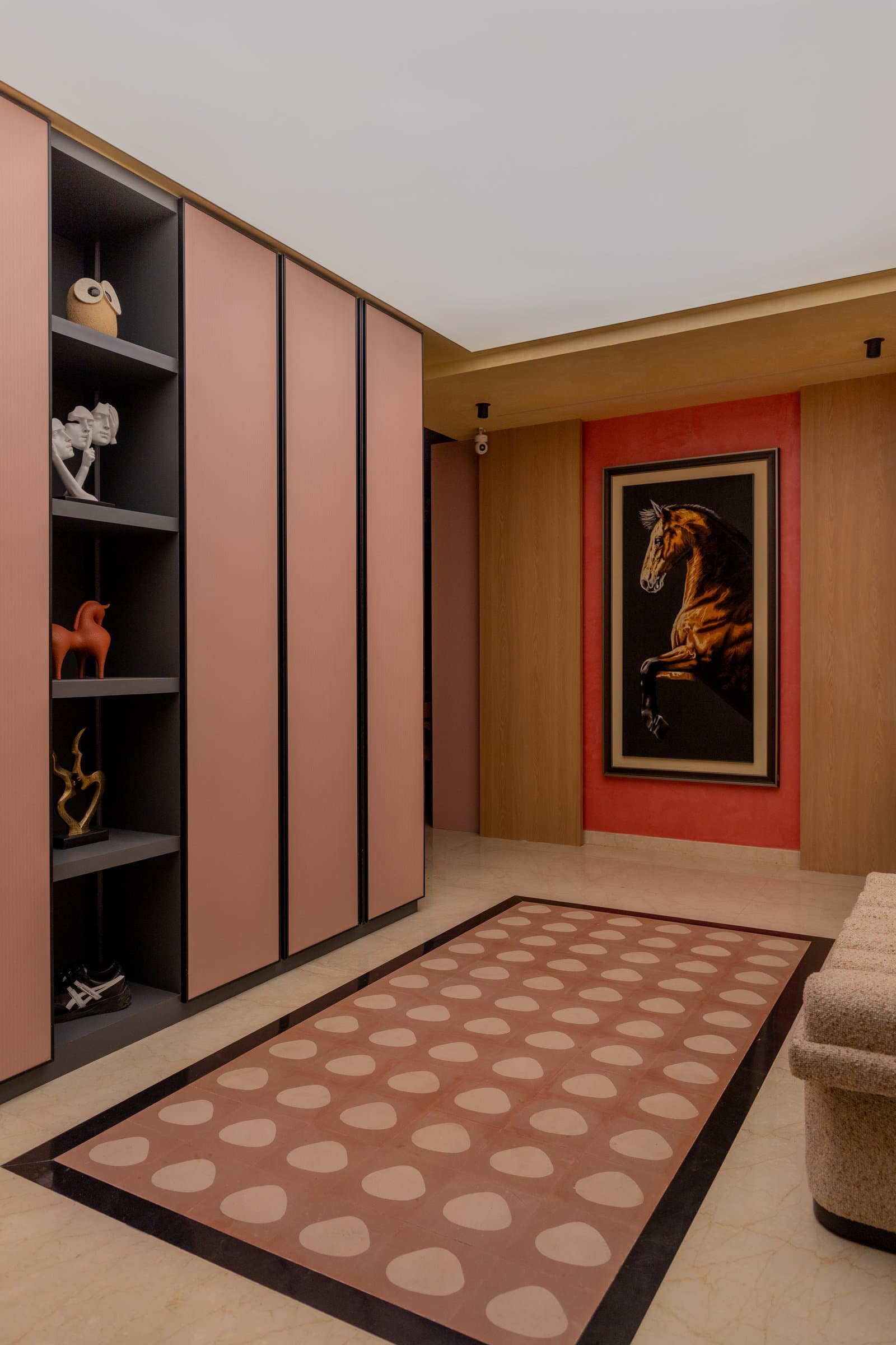
The foyer establishes the home’s material and tonal language in a single, composed gesture. A full-height dusty pink storage wall, articulated with fluted panels, incorporates open niches for a curated display of sculptures, while an equestrian artwork set against a terracotta accent wall brings depth to the wood-panelled composition opposite. Underfoot, a Borobu tile inlay framed in dark stone replaces the traditional entry rug, creating a ceremonial threshold that responds elegantly to the client’s preference for an interior free of dust-trapping textiles.
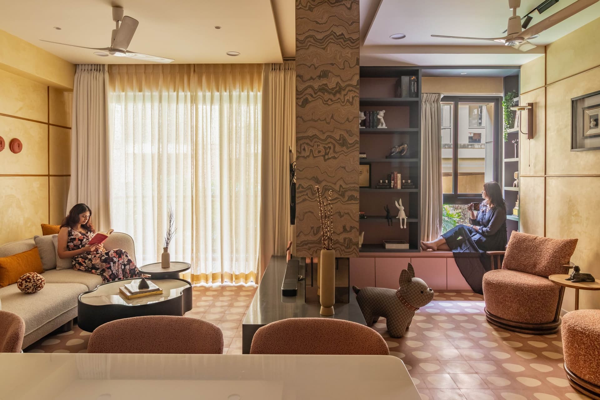
The living room extends this material language into a richer composition. Bouclé seating in soft cream and rust gathers around a sculptural marble-topped coffee table, while a patterned Borobu tile inlay grounds the seating area with subtle texture. A book-matched, onyx-veined backdrop lends the media wall a quiet sense of drama, becoming the room’s principal architectural focal point.
At one end, a window-seat nook transforms an otherwise residual corner into an intimate retreat. Pink lacquered storage is integrated beneath the seat, while open shelving above accommodates books and personal objects without adding visual clutter. The intervention reflects the studio’s broader approach, where every architectural recess is carefully considered and every square foot is given a purposeful role.
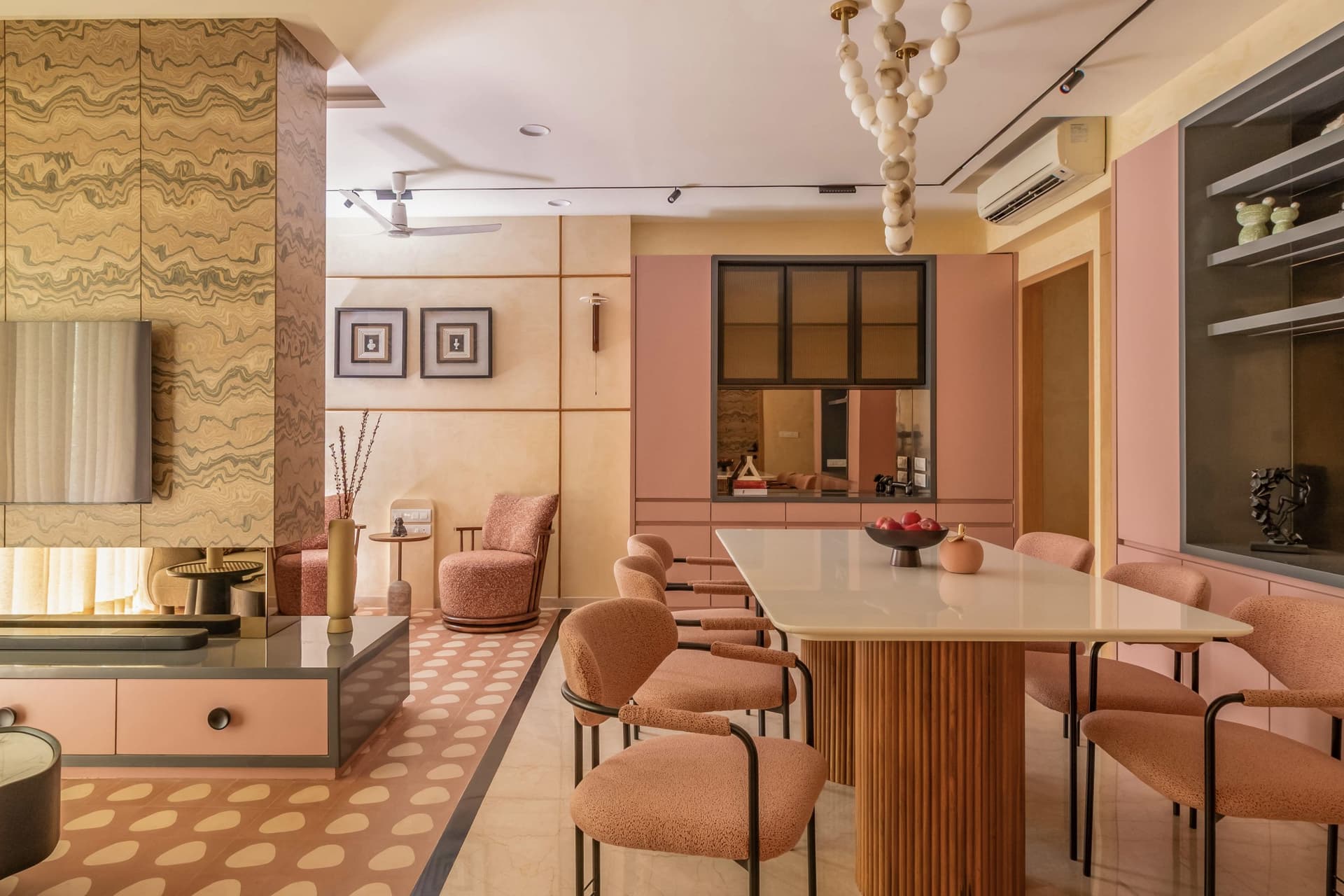
The living and dining areas unfold as a continuous spatial composition, unified by a Borobu tile inlay that flows across the floor and a warm limewashed feature wall detailed with a refined grid of slim wooden battens. A fluted wooden pedestal anchors the dining table, while bouclé-upholstered chairs carry forward the soft material palette established in the adjoining living room.
Overhead, a sculptural pendant composed of pale spherical forms introduces a gentle moment of playfulness without disrupting the room’s restraint. A fluted-glass service window links the dining space to the kitchen beyond, maintaining visual connection while subtly defining the two zones.
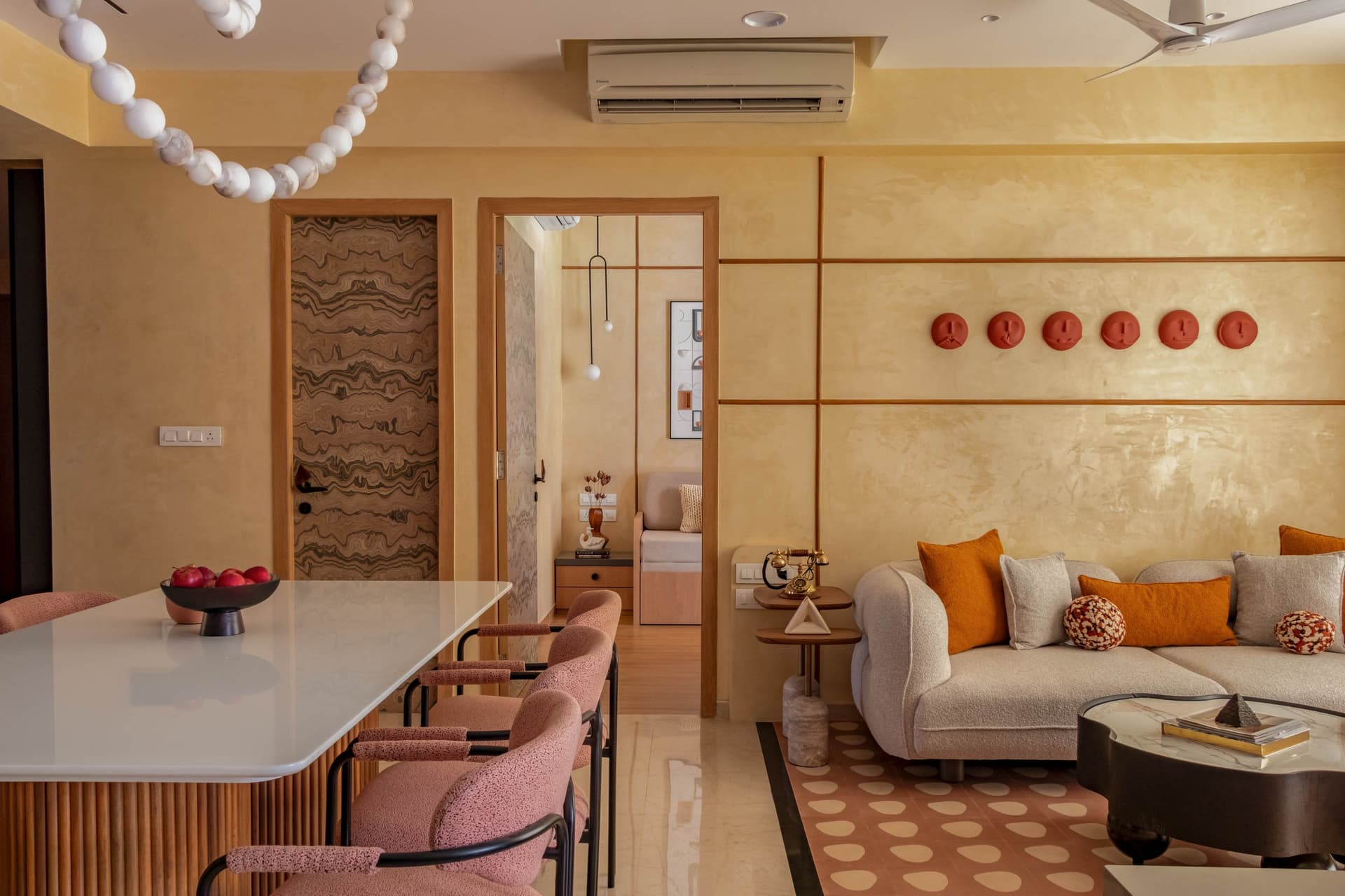
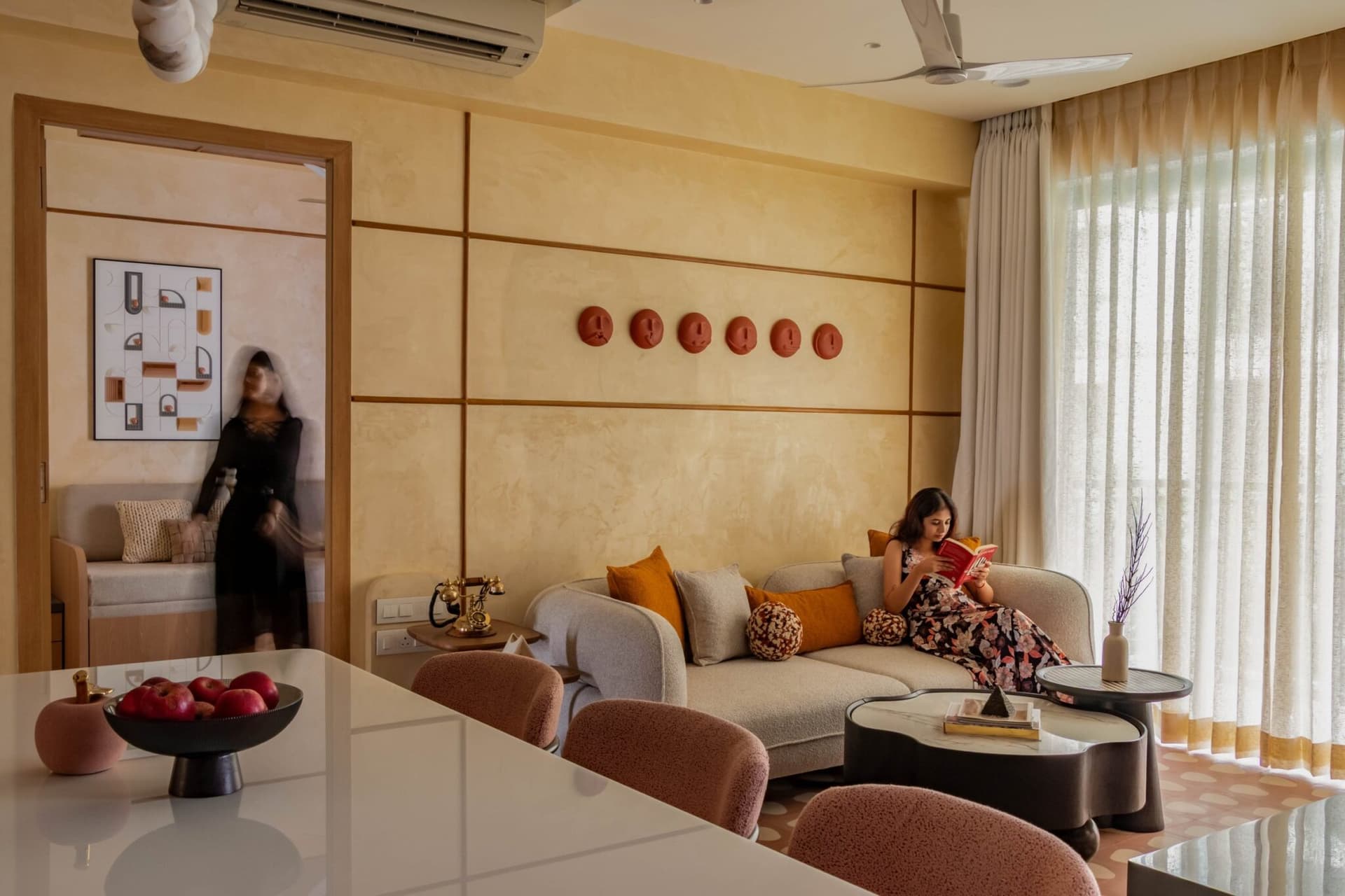
Seen from the dining end, the home’s material narrative becomes more fully apparent. A row of handcrafted terracotta face plaques punctuates the warm ochre plastered wall above the sofa, introducing a quiet layer of artisanal character. The intervention subtly grounds the home’s Japandi restraint in an Indian craft tradition, lending the otherwise minimalist interior a greater sense of cultural familiarity and warmth.
From the reverse perspective, the living room reveals a more intimate sense of scale. The feature wall, composed of warm ochre plaster articulated with a refined grid of slim timber inlays, introduces a quiet architectural rhythm that lends depth without excess. Against this carefully ordered backdrop, the handcrafted terracotta face plaques feel seamlessly integrated into the composition rather than simply decorative additions.
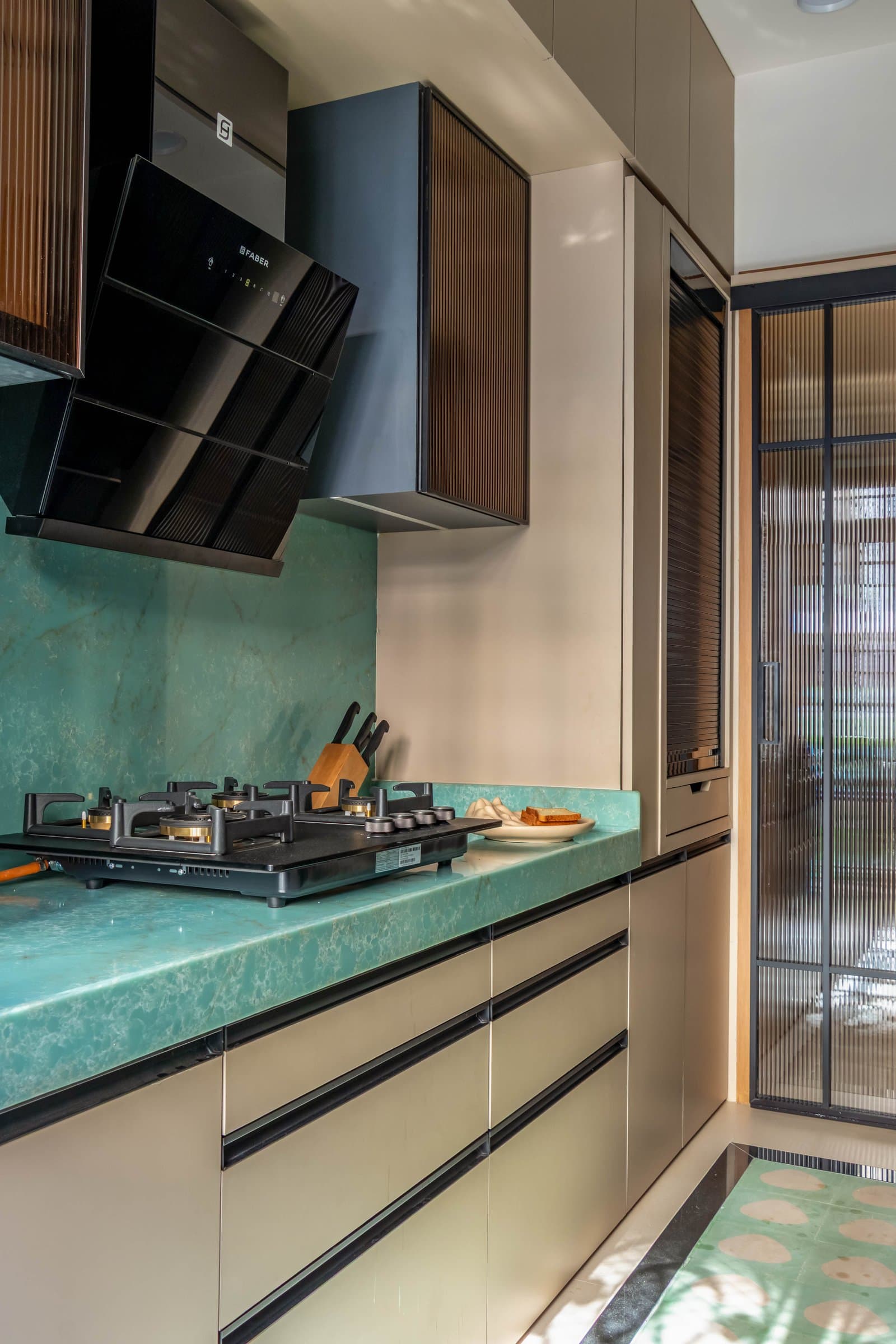
The kitchen introduces a deliberate shift in the home’s material palette while remaining consistent with its overall restraint. A richly veined green stone countertop and matching backsplash are paired with taupe cabinetry and reeded-glass upper cabinets, creating a workspace that feels both refined and highly functional. Distinct from the warmer social spaces, the kitchen establishes its own identity without disrupting the home’s overarching material continuity.
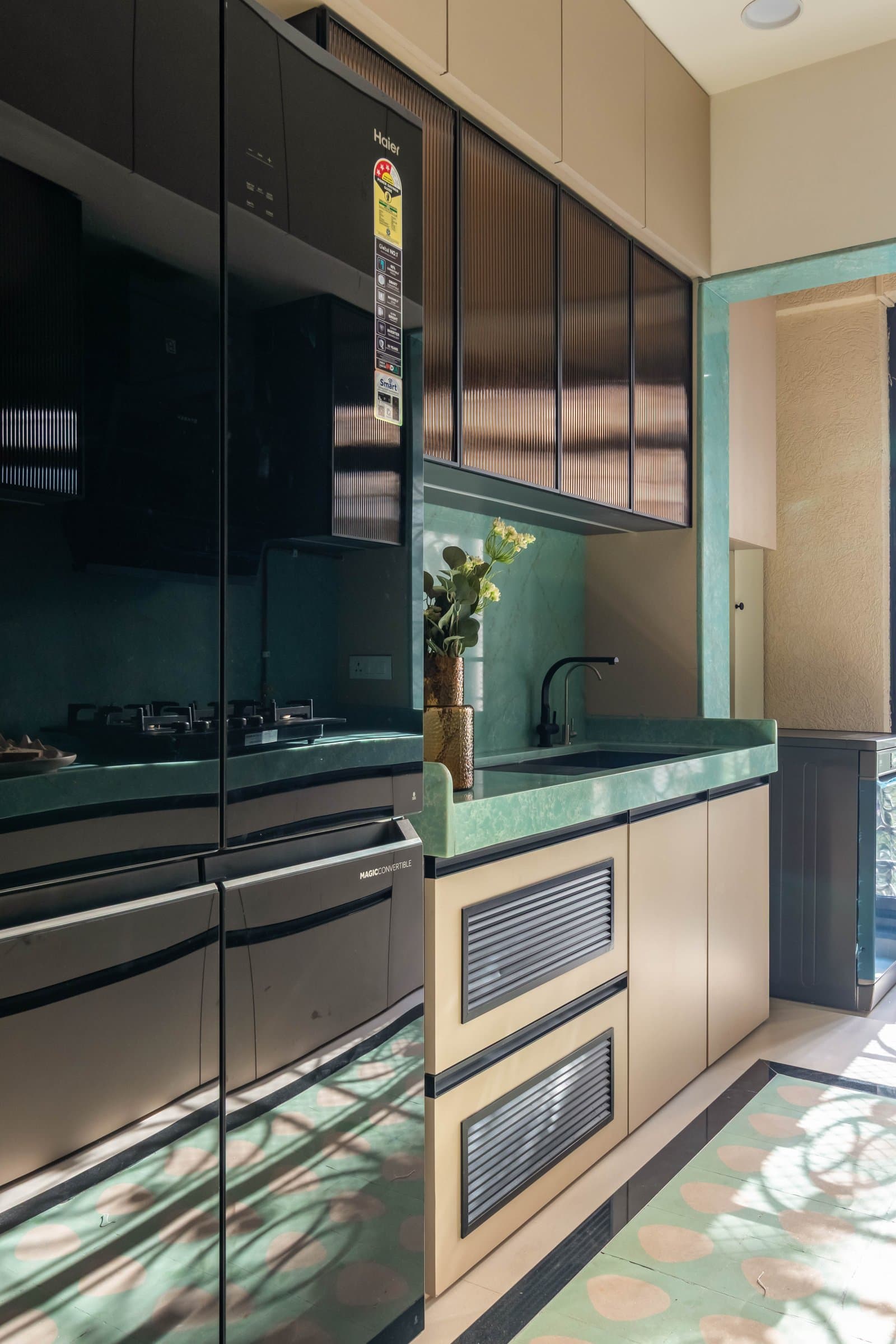
The return counter extends the kitchen’s material continuity, with the same richly veined green stone wrapping the sink and splashback. A tall dark-glass appliance cabinet discreetly conceals the kitchen’s more utilitarian functions, allowing the composition to remain visually calm and uncluttered. Underfoot, Borobu tiles reappear in a complementary green palette, subtly linking the kitchen back to the material language first introduced in the foyer.
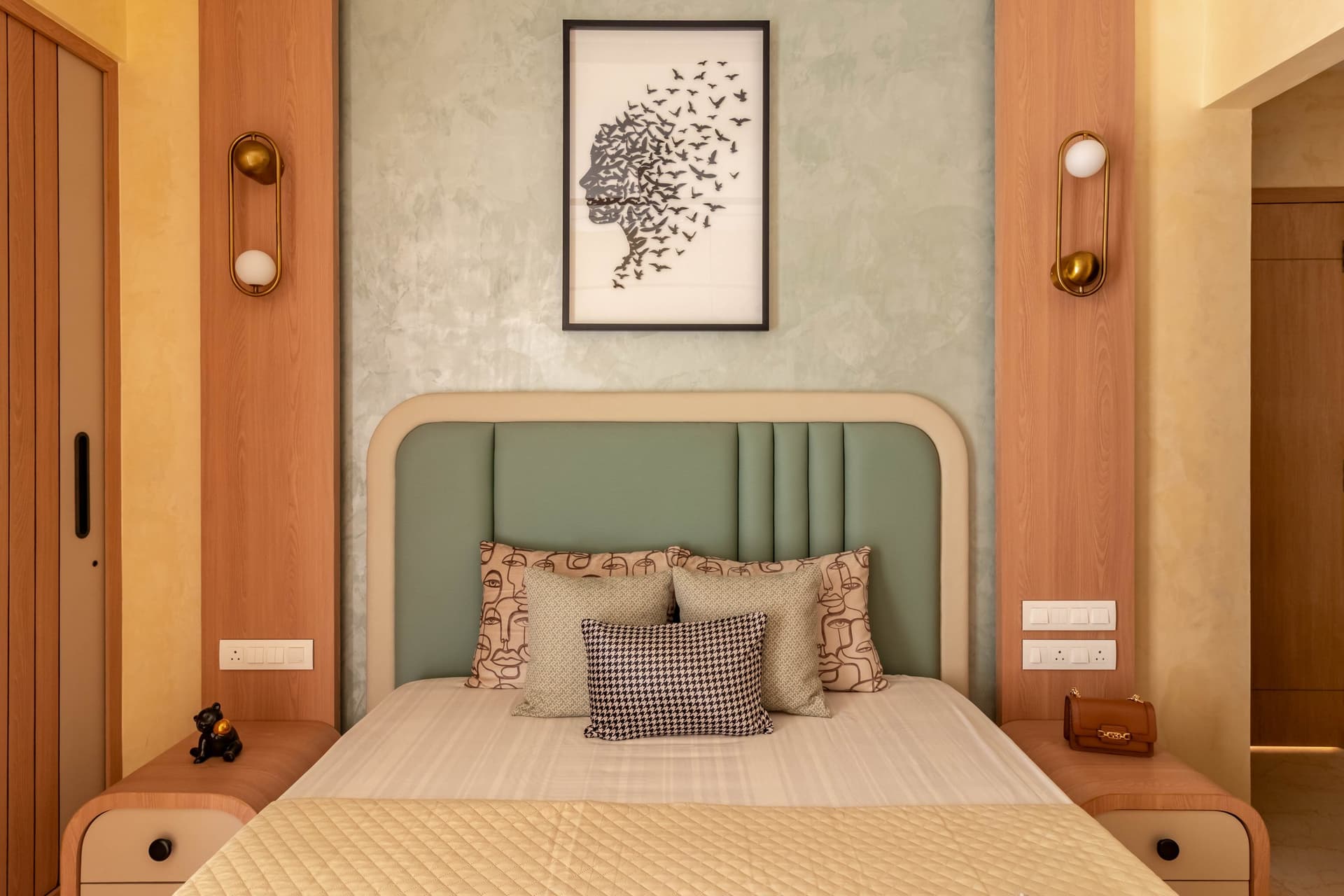
The principal bedroom shifts the home into a quieter, more contemplative register. A soft sage upholstered headboard, framed in cream, is set against a limewashed feature wall in a complementary green tone, while warm timber panelling and a pair of brass-and-globe sconces introduce a sense of balance and understated elegance. The restrained palette creates an atmosphere that feels calm, restorative, and softly layered.
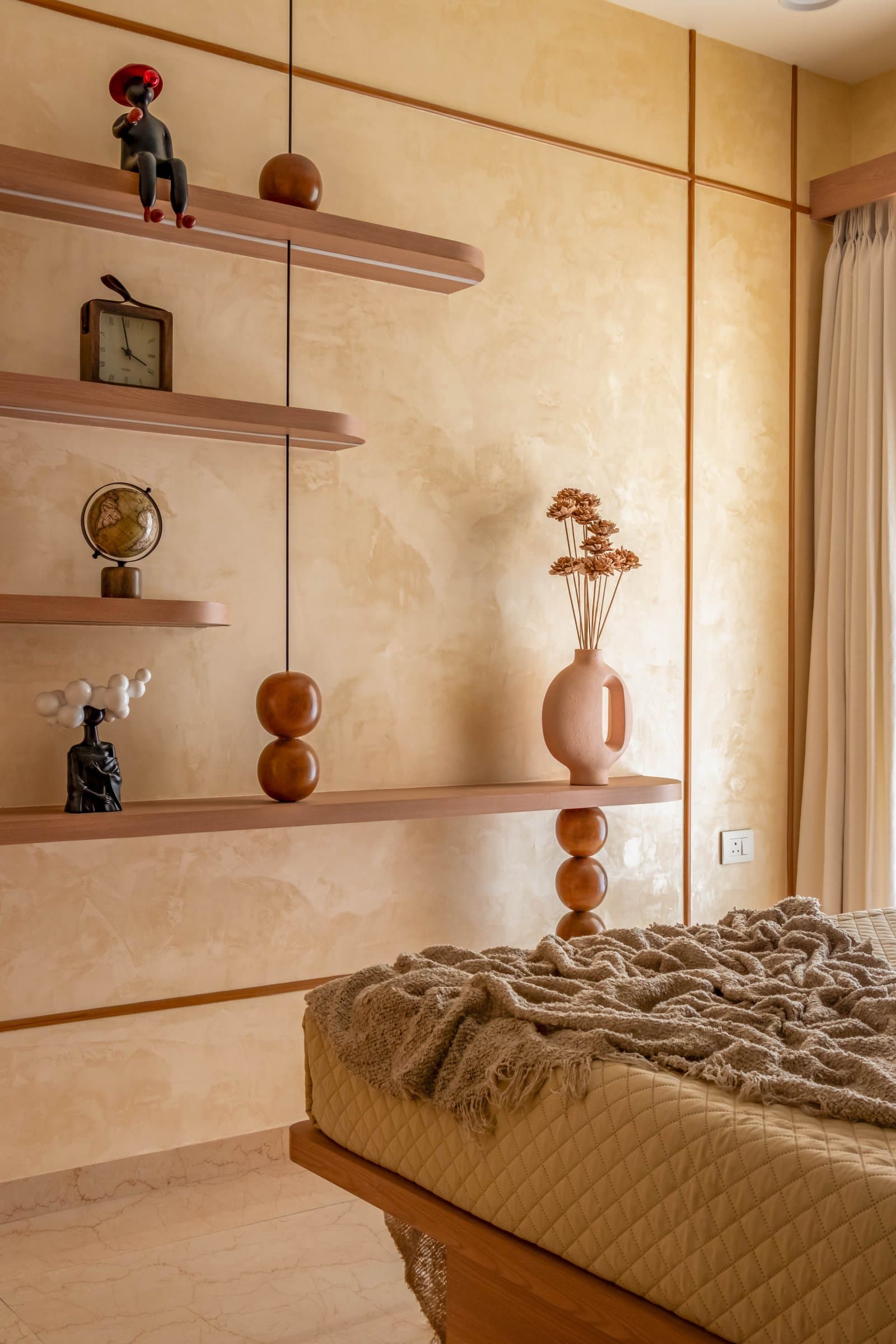
A wall-mounted composition of asymmetrical floating shelves replaces the need for a conventional dresser, offering display and storage without adding visual weight to the room. Curated sculptural objects and a terracotta vase punctuate the limewashed wall with quiet moments of personality, while the gridded timber batten detailing carries the home’s architectural language seamlessly into the private quarters, reinforcing a sense of continuity throughout the residence.
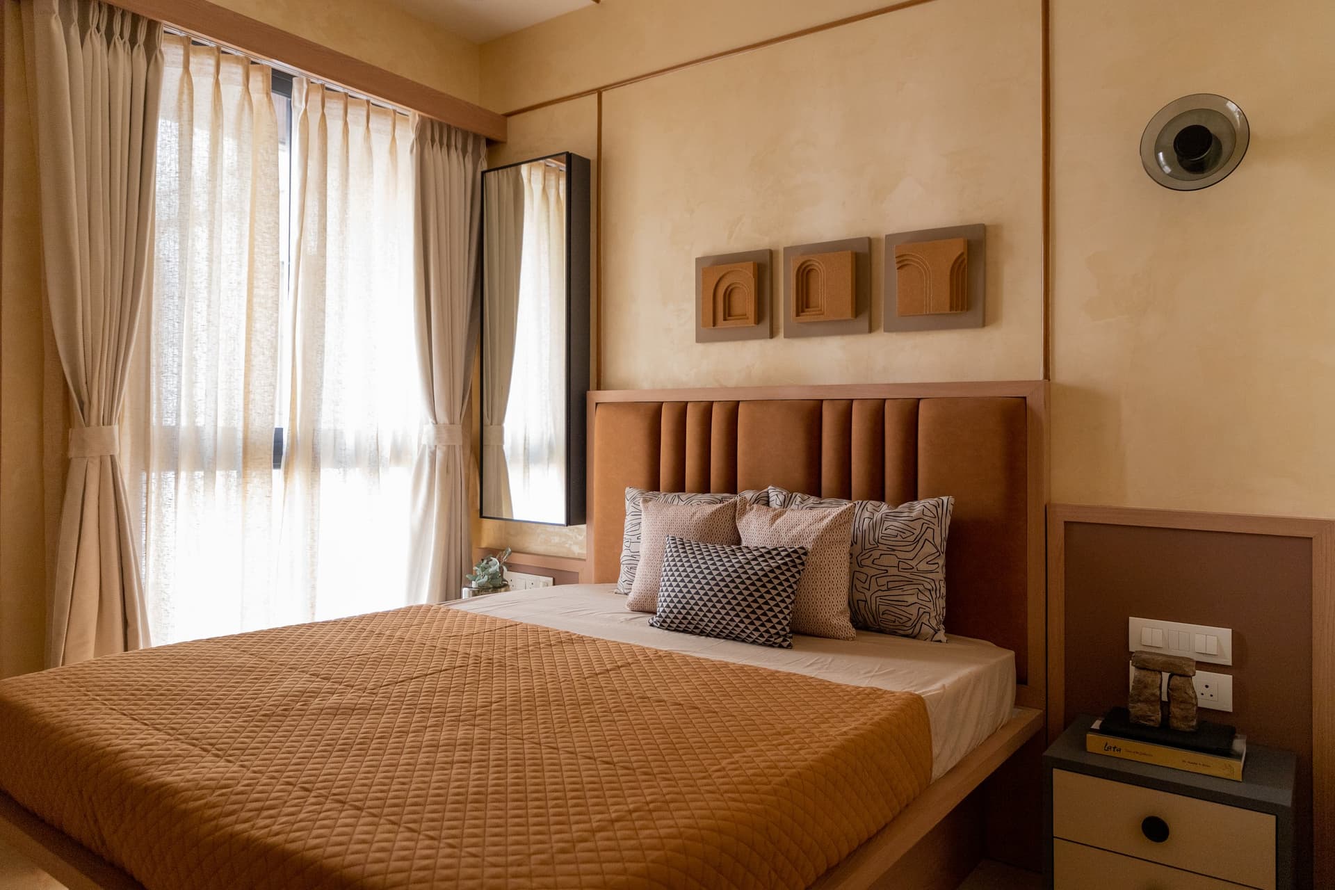
The second bedroom adopts a richer, more enveloping palette centred on warm amber and rust tones. A channelled upholstered headboard in deep terracotta rests beneath a triptych of moulded arched relief panels, introducing subtle architectural depth to the wall. Warm limewashed surfaces soften the composition, while daylight filtering through sheer curtains lends the room a gentle, diffused glow that enhances its restful character.
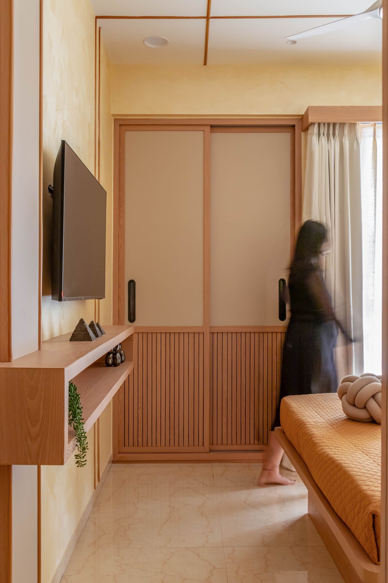
Across from the bed, a media wall with a floating timber console and slatted wood detailing along the wardrobe base expresses the home’s Japandi influences with quiet confidence. Above, frosted sliding wardrobe doors framed in warm timber subtly reference the proportions and translucency of traditional shoji screens, reinterpreting their vocabulary in a contemporary manner without slipping into imitation or pastiche.
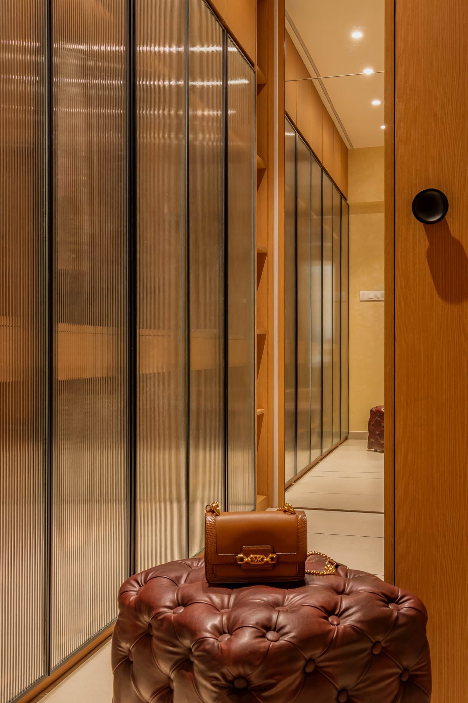
The dressing corridor demonstrates the studio’s commitment to treating transitional spaces with the same level of consideration as the primary rooms. Reeded-glass wardrobe fronts, framed in slender dark metal and punctuated by warm timber columns, diffuse natural light into a soft, amber glow. At the centre, a tufted leather ottoman introduces a note of classic refinement, lending the otherwise restrained composition a sense of quiet richness.
More broadly, Lodha Sterling proposes a thoughtful act of reinterpretation rather than imitation. While Japandi has become an increasingly familiar design language in Indian homes, it is often reduced to a minimalist aesthetic detached from local context. Here, Maksideo Design Consultants weave handcrafted Borobu tiles, limewashed plaster, terracotta accents, and tactile natural materials into a framework of Japanese-inspired restraint, allowing the home to feel rooted in its setting rather than imported from elsewhere.
The result is an interior that feels authentic rather than borrowed. Calm, tactile, and deeply functional, the residence demonstrates how international design influences can be adapted to Indian lifestyles without losing their essence. By responding closely to the client’s practical needs while embracing craftsmanship and material warmth, Lodha Sterling makes a compelling case for a more culturally nuanced interpretation of contemporary minimalism.